Case Study: Super Secretary
A.I. Secretary for Clinics
Project Summary
Client: Easy Health
Product: An AI-powered scheduling assistant designed to optimize receptionist workflows in medical clinics and minimize empty slots in the schedule.
Duration: 3 weeks
Role: UX/UI Designer
Tools: Figma, Competitive Analysis, Benchmarking, Heuristic Evaluation, Google Analytics, Microsoft Clarity, interviews, MoSCoW, A/B testin
Goals
Mapear as necessidades e dores no que diz respeito ao relacionamento secretária e paciente, apresentar oportunidades de mercado assim como diferenciais competitivos, e produzir um protóripo de alta fidelidade, para web e mobile, com a possibilidade de funcionar junto ou separado do software Easy Health.

Challenges
-
O público alvo deve ter clareza no valor que o produto traz para a sua clínica, número de agendamentos, cancelamentos convertidos e mais...
-
O público alvo tem resistência a alimentar a i.a., isso deve vir o máximo possível pronto para uso.
-
Diferentes linguagens devem ser propostas pois diferentes perfis de clínicas vão atingir a um diferente perfil de público e a qualidade da comunicação é vista de forma diferente.
-
Descobrir os processos aonde a i.a. pode otimizar a jornada da secretária e do paciente.
Research and Discovery
-
CSD Matrix
-
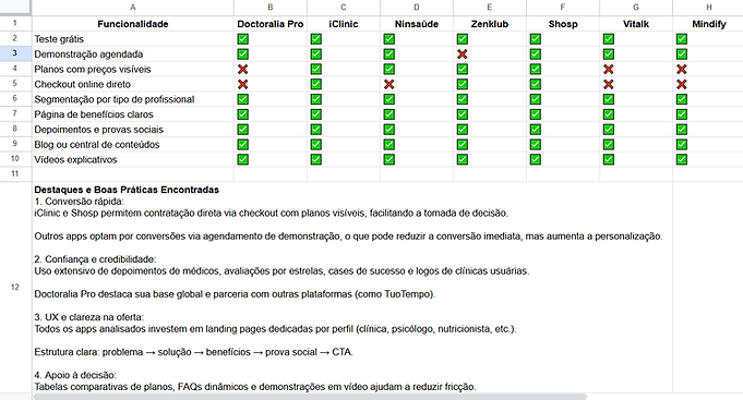
Benchmarking
-
One-on-one interviews
-
Data-driven personas
-
Competitive audit
-
MoSCoW method
-
User flow
-
Information architecture
-
A/B testing
Key Insights
-
O maior problema em termos de reclamações médicas é o abandono de consultas em cima da hora, impossibilitando o aproveitamento do horário vazio abandonado pelo cliente.
-
Um tempo considerável da secretária é perdido em comunicação com os clientes com reagendamento, lembrete de consultas e questionários pré consultas.
-
WhatsApp é de longe o meio de comunicação número 1 das clínicas brasileiras, substituindo o e-mail eo telefone como comunicação oficial.

Proposed Solutions
-
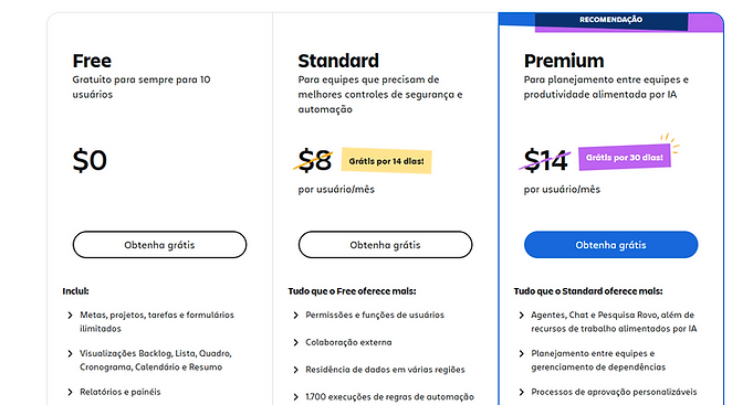
Basic plan (nutritionists)
-
Intermediate plan (beginner doctors)
-
Premium plan (clinic owners)
-
Subscription models: monthly and annual (with a 15% discount)
-
Payment methods: credit card, debit card, and Pix
-
Familiar layout: inspired by major e-commerce platforms (Amazon, Netflix, Americanas)
-
User-centered design: simple flow focused on few clicks and high visual clarity

Testing and Iterations
-
A/B tests with different versions of the store for doctors in the test group
-
Adjustments to structure and communication based on feedback
-
Behavior analysis using Microsoft Clarity (heatmaps) and Google Analytics

Results
-
Conversion: 17% of free users migrated to paid plans within the first 30 days, without any marketing campaign
-
Qualified interest: 32% increase in traffic from doctors who own clinics
-
Engagement: 68% of free users started using the store
-
Cart abandonment rate: 60% (vs. national average of 82%)
-
Cancellations:
-
38% within 30 days
-
16% within 90 days
-
12% after 90 days

Lessons Learned
-
Having data and insights is not enough — it is necessary to know how to communicate and sell the idea.
-
Storytelling, trust, and data are powerful tools in discussions with stakeholders.
-
Customer-centric culture must permeate the entire team — recurring presentations help achieve this.
-
Status and aesthetics are decisive for the premium audience.
-
A/B testing helped eliminate internal biases and increased conversion rates.
-
Design needs to consider the non-technical profile of the medical audience.

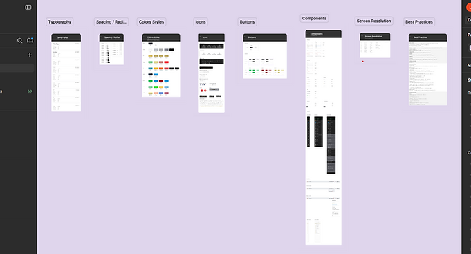
Hand Off UX / UX
-
Personas
-
User journey
-
User flow
-
Benchmarking
-
Product Requirements
-
Research Report
-
User Flow
-
Interactive Prototypes
-
Guidelines Visuais
-
Reusable Components (UI Kit)
-
Responsive Layout Table